
Ever listened to a record and thought: “This takes me back”? Good design can do the same.
When we talk about user experience, we often focus on metrics, behavior patterns, and efficiency. But there’s one essential dimension we tend to overlook: emotion.
In this article, we’ll explore how the spirit of metal and the aesthetics of vintage design can level up UX/UI to create experiences with soul, identity, and emotional impact. Because sometimes, to innovate, you need to go back to your roots.
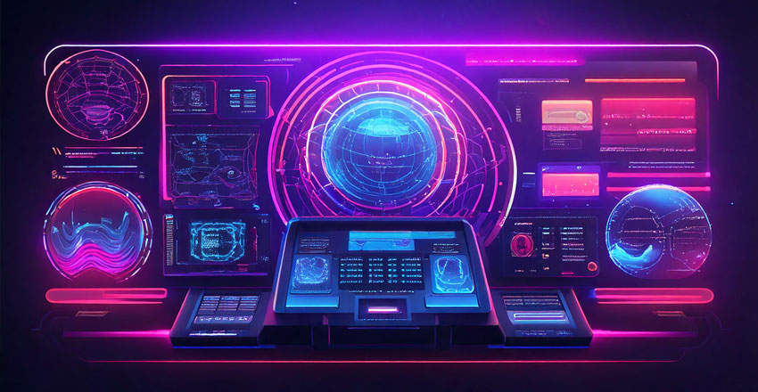
Retro design isn’t just a trend: it’s an emotional tool.
Using pixelated fonts, analog textures, or interfaces reminiscent of ‘80s games isn’t just about “making it look cool.” It’s about evoking memories. It’s about making users feel something familiar, something alive.
Heavy metal does the same thing. Listen to Iron Maiden or Black Sabbath — it’s not just good music: it transports you. The sonic atmosphere fuses with a clear aesthetic — gothic fonts, fantasy illustrations, dark palettes — to build a solid emotional identity.
We see the same thing with brands like Stranger Things or games like Metal: Hellsinger, which blend retro flair with heavy vibes to deliver intense and memorable experiences.
What can we learn from this?
That UX isn’t just about usability. It’s about visual storytelling. It’s about connecting with the user's personal history. And few things do that as powerfully as well-used nostalgia.
The best metal bands have one thing in common: a recognizable visual and sonic identity from the very first second.
Think about Slipknot: masks, logos, dark palettes, aggressive sound. Every detail screams the same personality. Or Ghost, with its theatrical aesthetic that spans artwork, stage design, and videos. There are no contradictions. There’s a unified brand universe.
In design, we often lose that by chasing “the latest trend.” But when an interface lacks a strong identity, users get lost. They don’t know who they’re interacting with. And that breaks the experience.
Being inspired by metal means designing with a bold voice. Whether your app, site, or platform leans toward dark, vintage, glam, lo-fi, or epic — the key is to keep it consistent in every detail: buttons, icons, micro-interactions, illustrations, tone of voice.
🎨 Metalhead UX tip:
If your interface were a metal band, which one would it be? What colors would it use? What would its intro sound like? What would the album cover look like? That exercise can help you find a strong emotional and visual direction.
The danger of retro design (and metal too) is going overboard. Just because the aesthetic is vintage doesn’t mean the experience should be outdated.
Take Doom Eternal for example: visually, it’s a metalhead time machine — full of album cover-inspired demons and dark fantasy — but the gameplay is fluid, modern, and addictive.
Same goes for digital products. You can use retro visuals — textured backgrounds, pixel icons, old-school loading bars — without sacrificing speed, accessibility, or clarity.
💡 Real example:
A productivity app with a synthwave aesthetic (like an ‘80s console) using smooth animations, clear hierarchy, and intuitive navigation can be 10x more engaging than a “modern” app with no soul.
Just like heavy metal, great UX/UI design isn’t just about technique. It’s about making people feel something.
Whether you’re using flat colors or VHS-style gradients, what matters is that your design says something. That it has a voice. That users don’t just understand how it works, but want to come back, to stick around, to tell others.
In a sea of interfaces that all look the same, design that has character (inspired by metal, retro vibes, or whatever makes you tick) is a competitive advantage.
So next time you open Figma, ask yourself:
Am I designing like a machine… or like a band that sells out stadiums?
Sr. Product & UX/UI Designer
I'm PoL, a multidisciplinary designer with 20 years of experience in Product Design, UI/UX and ecommerce.
© . All rights reserved by ✧ Polaris.
